Rocky Mountain Institute
Web Design for Nonprofit Environmental Research and Educational Foundation
The Challenge
In 2014 Rocky Mountain Institute partnered with Richard Branson’s Carbon War Room, a nongovernmental organization (NGO) adeptly focused on building up marketplace solutions for a low carbon economy. The merger of these two environmentally organizations “will multiply their respective impacts by jointly accelerating demand and financing for low-carbon solutions that are technically feasible and cost effective today.” And with this power-move alliance came a library of information for readers and site visitors. Tasked to information architect the extensive research and studies of the allied stakeholders, Fireant Studio moved quickly on constructing a framework that translated into an engaging and effortlessly navigable website.
The Solution
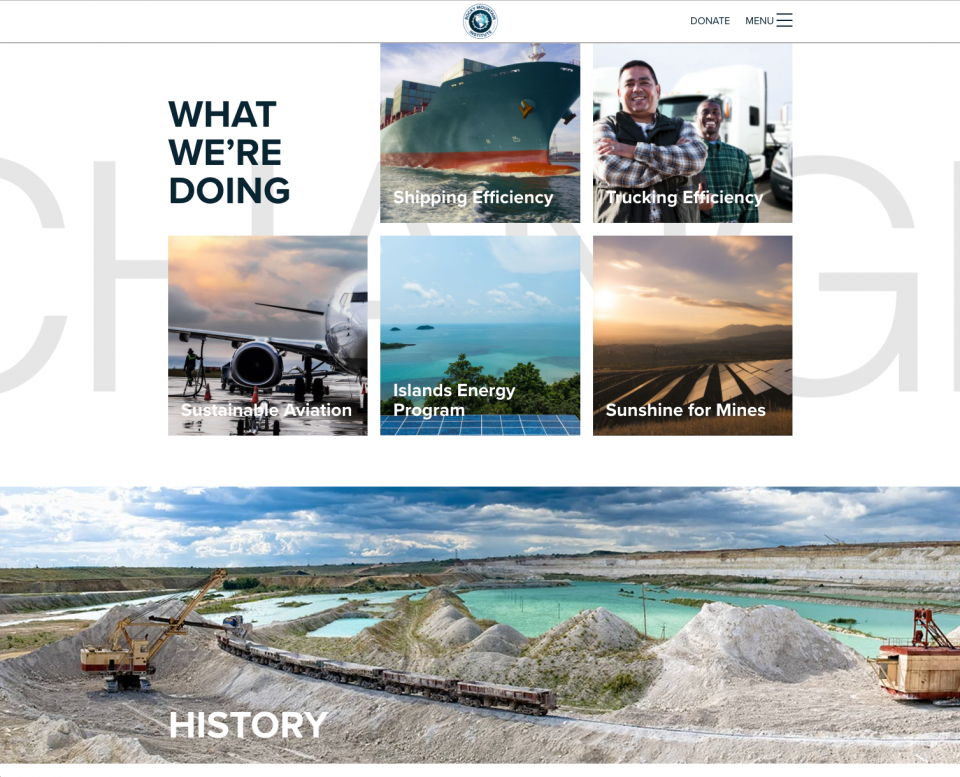
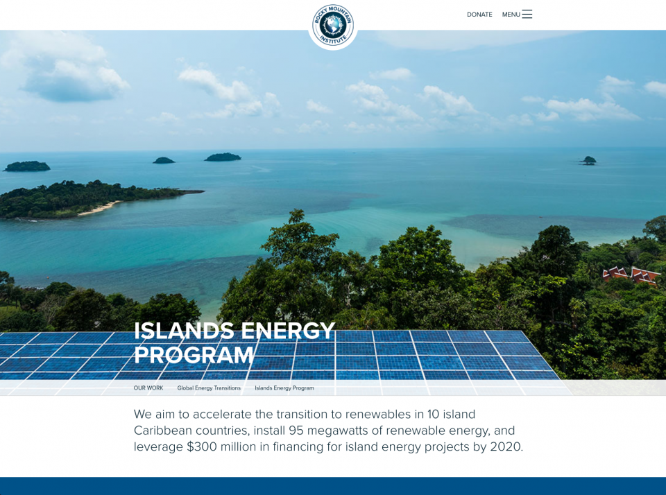
Partnering with RMI to create a layout and design with the user experience at the heart of it all. Immersive throughout, the editorial look and feel of RMI’s newly redeveloped digital space presents with intention the imperative work of the organization coupled with compelling call-to-actions at every step of the way. By virtue of design users are fluidly guided, lengthening session durations and pageview averages, to discover and familiarize themselves with RMI’s curated content and overarching mission. Our development team worked closely with RMI to create their vision of a digital story worth reading. Easy to use, easy to manage, the site now addresses RMI’s most critical touchpoints - low-carbon advocacy, user engagement, and donation acquisition that ensures its continuation of work.
Services Provided
Mission Critical Storytelling
As we teamed up with RMI to define the goals of this new site, a target quickly emerged. RMI envisioned a website that presented its story both meaningfully and inspirationally, inviting users down a vivid path of content exploration with full access to the depth of its environmental research and findings. To answer the call, we developed a content structure and design aesthetic that trails users from one relevant piece of content to the next, intuitively, fluidly. As a result, RMI’s areas of involvement are fully highlighted and displayed from start to finish, capturing a digitally profound and persuasive narrative.
“This new site tells our story—how and why we transform global energy use for a clean, prosperous, secure low-carbon future." - Rocky Mountain Institute
Richer User Experiences
When it comes to site and content exploration, today’s user demands rich experience and free-flowing flexibility across platforms and devices. Built using our custom WordPress solution, RMI’s newly reworked content management system (CMS) provides a strong and steady foundation that is effortless for users to navigate and painless for non-technical CMS managers to maintain and expand as content demands grow.
Designing a Path Towards Action
Immersive content tied to relevant call-to-actions (CTA) was coordinated throughout the RMI site. Its mission demanded it. As users scroll through topics and subjects of interest – across mobile, tablet, or desktop devices – our UX solution sought to effectively guide readers down a simple path towards action. Cross-platform, thoughtfully designed CTA’s deliver an interchangeable and compelling experience to the user. Since it’s launch RMI’s
TL;DR
(TOO LONG; DIDN'T READ)
Prioritizing users and their content exploration across devices, across platforms, Rocky Mountain Institute’s new site helps highlight this nonprofit’s work and deeply connect with audiences through CTA’s and beyond.