In 2013, FIREANT launched the first website campaign for LiveWell Colorado’s Get Movin’ Challenge, a month long challenge encouraging Colorado adults to ‘get movin’ for 30 minutes a day for 30 days. In order to successfully launch a website campaign, timeliness and extensive QA (Quality Assurance) takes precedent. This campaign was a huge success, launched with enough time to create a lot of buzz and harness an online presence with superior user experience. FIREANT excels at structuring an entire website campaign from conception to launch and meeting all necessary deadlines throughout the process. Livewell and FIREANT were excited to create a new website campaign this year, focusing on pushing the boundaries and including even more content and functionality than last year.

Website Campaign for 2014

On April 21, we launched the 2014 Get Movin’ Challenge. The discussion of the project began in mid February and the process of wireframing began March 5. In seven short weeks FIREANT had the website campaign designed, developed and ready for public viewing.
While a QA process is always necessary to check against designs and test all the functionality of a site, it is possible something else might come up out of the woodwork. In this regards, FIREANT is not a website factory. We do not push out a product, and say “see ya!” We stick around and work closely with clients to make sure our product is interacting effectively with users and fulfills its purpose. This was especially necessary for the social integration of this website campaign, as we will discuss below.
Cool Elements You Don’t Want to Miss!
Designed to get people motivated to move and interact with many parts of the site, FIREANT used a unique scrolling feature to help guide the user through different parts of the campaign. This has been disabled on mobile, for a more clean tablet and phone swiping experience. There are multiple slider areas with images, copy, Calls To Action and even a YouTube API integration for video playing. One prominent slider area includes incentive prize slides which encourage participants to complete all 30 days.
We also built a custom Ambassador form, designed for motivating individuals state-wide to become accountable Ambassadors, increasing their influence and involvement in the challenge.
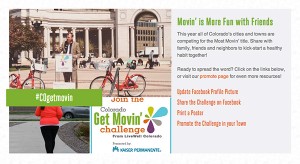
A ‘share’ scroll section on the campaign includes links to downloadable assets for Coloradans to share logos, posters, change their Facebook picture or post the campaign to their timeline. Next to the assets is a feed of Instagram photos containing the hashtag: #COgetmovin. Anyone using Instagram and tagging their photos with that hashtag will automatically be streamed onto the website campaign! As mentioned earlier, we continue to check the website after the launch to make sure the feed and the other social integrations are working properly and correctly as users begin to make the hashtag and interact with the campaign.

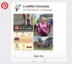
In addition to the Instagram feed, the homepage features three columns under the main slider which have Twitter, Facebook, and Pinterest integrated into the campaign. The Twitter column contains a feed similar to the Instagram functionality. Tweets containing #COgetmovin are streamed into this column of the website campaign’s front page. The middle Facebook column contains an easy-click “Like” button and a counter of LiveWell Colorado’s Facebook page likes. The Pinterest column features the CO Get Movin Pinterest board in an appropriate sized container. This special website feature drives users to the Pinterest page and is very hooking on the iPad or mobile device as you can scroll through and view the many pins that offer advice, inspiration, and visually capturing images.
To participate in the Get Movin’ Challenge, LiveWell Colorado works with a third party fitness tracker, MapMyFitness. MapMyFitness allows people to enter their time and type of activity in an app to track their fitness, which works exceptionally well for this challenge. This year the challenge expanded to include cities in addition to individuals. In order to accommodate and feature this change, we worked with MMF to showcase a city leaderboard (in addition to the individuals), as well as created a custom slider for participating cities on the homepage. Check it out!
Launching this website campaign to help improve the fitness of our home state, as well as encourage fun and supportive online interaction, made this project an enjoyable experience for our team. We look forward to the challenge being a success and all the participants experiencing the amazing website campaign!

