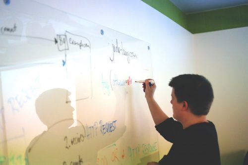
Five years ago, our design process (and I can only assume others) looked similar to this. New client – yeah! Let’s gather some business and design requirements and start down the road of iterating through designs. We’d hand off 2 or 3 sets of homepage comps to illustrate how the solution would look aesthetically. This worked great for smaller ‘brochure-ware’ websites as the content model and user interaction were relatively scripted. However, as sites became more and more complex this simple approach of moving directly into design didn’t work. Major areas of functionality were being overlooked due to the aesthetic direction driving the process. We knew then that this approach wasn’t going to deliver the results for the solutions we were developing.
What we did to solve this problem was significantly front load the project scope. Instead of a brief discovery period followed directly by the design process, we more than doubled our upfront investigation, planning and process around developing a site-wide strategy and interactive model. By doubling this, which seems to add more time, we’ve been able to streamline and reduce our development and design time by laying everything out up front. We’ve accomplished this by spending a significant amount of the upfront development time focusing on Information Architecture (IA), User Experience (UX) and how those findings come to life through our wireframing process.
Our wireframing process is very iterative and hands on with the client to ensure we capture all the desired interactions within the client’s content. During this phase, we focus exclusively on content positioning/ layout and how the user will be able to interact with each element. Throughout each iteration, we add another layer of detail to support the content model and desired level of interaction with the site. We do our best to remove stylistic formatting within the wireframe presentation to keep the client focused on how we are supporting user interaction and content display – not getting hung up on the wrong shade of green or a hero image on the site. We focus on the layout, the design and interaction and then we can work on the little details in the development stage, the look and feel, in the most basic way, is what matters here.
The end result is an interactive click through which allows the client to explore the site and its content prior to starting the aesthetic design and development. This approach has become an increasingly critical phase as we support multiple display outputs from one code base. Our process of developing wireframes on top of our base responsive framework allows us to showcase how the designs and content will respond when viewed at different screen sizes (desktop, tablet, mobile). Therefore, the client can not only get a 1st hand experience of how the site will look and feel for how the site’s content will look and feel on each device, but also how the interactivity is supported at each screen size.
Lastly, this process greatly benefits our internal design and development teams. Being involved at each of the critical milestones associated with the wireframe buildout ensures our teams have evaluated and signed off on both the content model as well as any interactions that need to be supported. Therefore, we’re not committing to or promising interaction that can’t be supported or will be greatly difficult to support. Once the client has signed off on the final wireframes we can begin to parallel design/develop the remainder of the solution. This works by allowing the designers to graphically flesh out the wireframes to ensure brand and aesthetic compliance. Simultaneously, our developers can begin working on developing the solution by knowing where the content will appear and what interactions the user has with that content. Developing the solution on 2 parallel paths enables us to deliver at a much higher rate while still ensuring the client’s needs are being met throughout. Most importantly, it minimizes the “I thought it was going to do X” conversation – which tends to have costly implications.
If you’re not getting this level of detail / planning for your interactive campaign, contact FIREANT to see how we can help.

