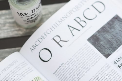
As Fireant is beginning to renovate our own website from the ground up, there are dozens of things to consider. One of the most basic but aesthetically crucial aspects of web design is typography. In recent years web designers are no longer bound by using only web-safe fonts; there are alternatives. With the introduction of these creative fonts and methods for embedding, costs and benefits present themselves. Fireant takes a look at embedding fonts vs. system fonts, and reviews how we work with clients to implement fonts.
Embedding
Perhaps it is a designer quirk, but we get sick of seeing the same system fonts all over the web. Not only are you very limited with system fonts, but with more and more people creating and using unique typography, it approaches laziness to use a default. It takes more time and effort, but the result is quality. As our lead designer, Shane, says, “If typography is chosen and crafted well, it shows that time and care have been put into the creation of a site.”
Also, embedding fonts is a superior technique to creating images for headings and navigation. Although it might look good and achieve the design you want, SEO (Search Engine Optimization) is lost without the keyword rich headings and navigation links.
On the topic of headings, the headers on your page need to look good next to the body copy. They should even “flirt a bit.” Shane prefers to use sans-serif (no decoration at the end of the stroke) for heading fonts. This is beneficial because their display is strong and confident, standing in nice contrast to a humanist body copy font being read in larger chunks.
How Does Fireant Embed?
If we are using Google Fonts for a project, we can link that font directly from google with a stylesheet link (e.g. < link href=’http://fonts.googleapis.com/css?family=Devonshire’ rel=’stylesheet’ type=’text/css’ >).
Typically though, we use a different technique. We download the font to our collection, upload the files to the site structure, and call it accordingly. This makes it easy to embed the font and call it specifically for different headings or the body copy, as well as limit the number of third parties we are reliant upon.
It is important to remember that not all fonts are free and some require licensing. We tend to avoid third party providers, such as Typekit and prefer secure, free tools such as Google Fonts and Font Squirrel for embedding into the site structure of the website after reading the licensing for each font we wish to use.
Typography and Clients
If a client doesn’t have a brand or font they already use, well, “then it’s like Christmas morning,” and the branding team has a lot to take into consideration. A usual starting point is looking at the client’s industry, and seeing if there is a general feel or font-type. For example, a medical office will require a different font palette from a bike shop. Fireant works closely with clients to achieve the perfect feel and digital presence, and often creates what we call “Style Tiles” or “Style Guides” to portray different fonts and colors for the client to visualize their brand.
Every once in awhile, a client has an internal designer and we will be unable to embed that particular font due to copyright issues. Or a client supplies us with non web-safe fonts they wanted to use. To amend these issues we use a font generator (such as Font Squirrel’s) to find a comparable web-safe type or font family as an alternative. The Style Tiles are a great way to present alternative choices for the client, displaying fonts next to their brand and color schemes. We always work with every client to to achieve a professional aesthetic on the web, and establish that everyone is pleased with the end result.
Here is a list of some great free fonts:

