Anchor Center for Blind Children
NONPROFIT WEBSITE DESIGN TO ENHANCE USER EXPERIENCE
The Challenge
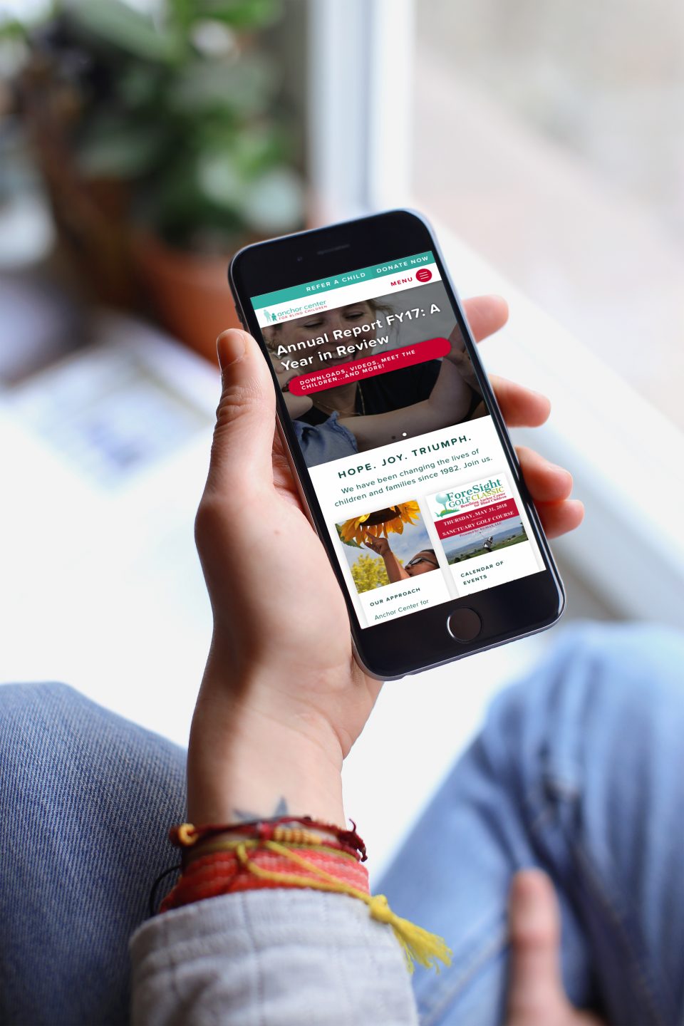
Denver base non-profit Anchor Center for Blind Children needed a new website to better support their mission of helping the visually impaired reach their highest potential. The previous website didn't provide the flexibility to support their content effectively, it was not designed to be responsive and work on mobile devices, the aesthetics of the web design were very dated and uninspiring. The result was a site that didn't effectively convey their message, provided little to no flexibility to support multiple content types and provided an award clunky interaction with their donation system.
hThe Solution
FIREANT worked with Anchor Center to optimize their information architecture for better message clarity, created functionality that prioritized a mobile first experience and provided call to actions that prioritized donations - all while engaging the audience with meaningful content. We created a flexible module based framework to display content and provide a more meaningful experience with the visitor. Creating a custom solution on the WordPress provided us the flexibility to easily support multiple content types, rich media, diverse layouts, streamlined integrations with BlackBaud Raiser Edge as well as a secure donation process which is entirely contained within their site. The result is a modern web design powered by a streamlined yet flexible content management system that allows Anchor to interact with those they support.
hServices Provided
Responsive Web Design
Working to communicate with a specific audience in a flexible and engaging manner, we created a customized wordpress solution that allows Anchor to meet their content needs and to properly communicate with that audience. This website redesign specifically worked to integrate previous member base and current client needs, allowing Anchor to maintain and grow strong relationships with their audience.
HIGHLIGHTS
Website Design
WordPress Development
Strategy
Information Architecture
Wireframing
3rd Party Integrations: BlackBaud Raisers Edge, MailChimp
Solutions for NonProfits
TLDR
(TOO LONG, DIDN'T READ)
Anchor wanted to provide an easy, meaningful way to interact with their audience. To help, we designed a flexible, media rich layout that created a simple way for Anchor to connect with those they support.