Iconography and Web Design

Understanding the Visual Message
Icons are abundant in our everyday lives, from our favorite web apps to traffic signals on our morning commute. Icons serve as visual cues, brand recognition; ideally, a system of global communication. The best icons are simple and effective: a vector image with a clear message based on an easily defined metaphor.
A great example of such an icon is the search icon, the magnifying glass. It casts visions of Sherlock Holmes searching for the clues to a murder mystery, just as you search the internet for cooking recipes, lyrics to your favorite song, or hunt down your next job. It’s a simple icon with a powerfully coherent goal and message.
How designers frame or layout a page directly affects how the audience responds to, understand, and remember information. The design, functionality, and content of a website all work together to deliver a user experience (UX) that hopefully results in the user gaining something from that experience. Icons, when done properly, are a great tool for incorporating design and functionality while delivering a clear goal.

Bridging the Physical and Digital Experience Through Iconography
While icons are used all around our physical world, their impacts in the digital world add something special. From an experience standpoint, iconography can be used to help speed up understanding and reduce cognitive load on the user. Since icons are metaphors, they can directly relate to what they are representing or portray an abstract meaning.
From a design and creative standpoint, iconography is fun! Our designers love receiving an icon project because they get to create something new and develop on objective metaphors to display a clear message for whatever website it is needed. For the overall design impact on a website, icons break up a page and add a new element so it becomes so much more than simply text and photos.
By creating a visual vector representing a section, category or service for a website, well executed iconography achieves a balance in functionality that is more sophisticated and artistic than simply placing links on a web page. FIREANT STUDIO has mastered blending a client’s brand and message into successful, useful iconography to fit any need.

Real Life Application of Icons
A popular use for icons on a web page is displaying services. The icons might be clickable and direct the user to a detail page explaining the service, possibly with examples of projects or work completed using that service.
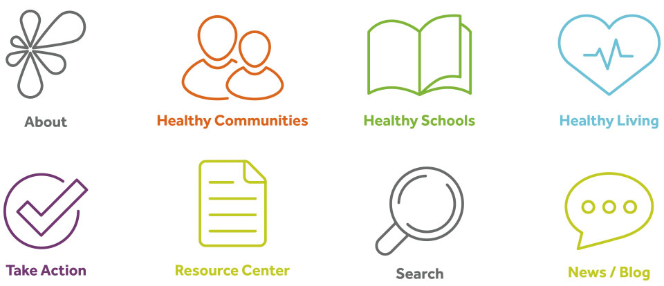
For a recent project, FIREANT completed a custom icon set for Denver nonprofit, LiveWell Colorado. LWC sought an innovative design solution to unify the organization’s mission with its overall branding. Our team designed icons to display core services — including Healthy Communities, Calls-To-Action, and Blog — allowing users to easily filter through LiveWell’s robust archive of information through use of the intuitive set of iconography.
![]()
Another example of implementing iconography for an exceptional user experience was for a healthcare campaign and solutions experts. FIREANT designed a front-end website featuring custom designed iconography that went beyond a visual cue or call-to-action. We implemented a series of icons that provided visual clarity to a process. The goals the campaign wished to illustrate to the user were enhanced by the visual progression in the iconography.
![]()
If you find yourself needing custom icons for your real life or website, FIREANT can lend a helping hand. Connect with Us!
